_____________________________________![]() Oops, science is POWERFUL!
Oops, science is POWERFUL!
ENGL 390, 390H, and (sometimes) 398V Class Journal
_____________________________________
What is a rain garden?
I will give you an arrangement and sources (logos) in class. We will work on board and then post the images/test. I will post follow-up notes on the arrangement on Tuesday, late in the day. You can compare this to what you have drafted.
The structure and type of paragraphs you will write follow Aristotle's (really, more the contribution of Hermanagoras!) stasis theory (very much a system of analysis and action, like your scientific method steps). You will open and close the memo with brief introductory paragraphs, but the meat and potatoes (or tofu and kale) of your memo will be these staged, disciplined paragraphs.
- Brief, Working Definition (what is a rain garden, briefly, by two functions)
- Classification (what type of technology is this? Hint: low impact development and storm water management)
- Extended Description (Illustrative; give detail on the layers of soil and the type of plants; best to divide the complex material into two parts, plants/function and soil layers/function)
- include two examples; consider the ones on campus (can be sep. para OR placed at end of doc)
- Evaluation (is this low impact technology good or bad? Use Dr. Davis' research as you do not have authority to evaluate based on your expertise)
I would think you need about one source per these paras: classifying, illustrating, evaluating. Use (author, date) citation from APA guidelines. Include a works cited page also.
Wednesday, we will work closely on sentences.
Peer revision of complete memo on Friday. Due in hard copy on Monday for a grade. You can print in the classroom.
Audience/Context/Purpose:
Audience scenario for this memo: Here is Jane, our boss. She asked for the memo at the end of our last staff meeting.
 irst up! What is a memo?
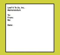
 By the way, the OWL website at Purdue is a fabulous resource for writing. Memos also have a standard format: See the image to the left. Also, look at the email heading in your software. This electronic message is based on the memo format.
Bonus question: what is the difference, traditionally, between a memo and a letter?
Topic Sentences: A list of qualities for you to strive for
- Usually a short direct sentence (think announcement)
- Signals the topic in the paragraph (think preview)
- Hooks the reader by 1) raising a question or 2) provoking thought
- Can be placed anywhere, but early on in the paragraph is the best default strategy for most professional documents; in other words, at the beginning of the paragraph
- Contains an element of transition from the previous paragraph
Pigeon science!
Gibson, B.; Wilkinson, M.; Kelly, D. (October 1, 2011). "Let the pigeon drive the bus: pigeons can plan future routes in a room". Animal Cognition. 15 (3): 379–91. doi:10.1007/s10071-011-0463-9. PMID 21965161.
Is this Mo Willem's pigeon? Think about remix culture v. copyright culture.
Readings for the week: skim. Develop a vocabulary for thinking/writing
- Really good overview here by a communication professional
- Student quiz-card set that you might appreciate (kinesthetic appeal, for one)
- Forest of Rhetoric approach at BYU that student-above "riffs off" (search here)
- Two slide sets
- San Jose State (Hawker)
- Michigan State
Option: You could see if OWL at Purdue includes rhetoric resources.
Next: another frame of classical rhetoric is stasis theory. Owl DOES take this on. Read here, to start. This four-page PDF is a good overview of stasis theory and relies on UMD English professor emerita Jeanne Fahnestock's work (my mentor). Author? Grant-Davy, English professor at Utah State.
I use stasis theory with environmental scientists: preview here (one slide).
Today, we will look at these terms (three proofs, five canons (slide 4 of 12)) in two ways:
- to analyze this class journal post
- to preview our definition memo about rain gardens

Pigeon book described at this Wikipedia page. View this less-than-three minute video:
Bonus: what do you think I am looking for? Hint: readers know genre patterns in documents. Do you see a pattern here?
Extra credit: pigeon science. Ask me.
Phrases that scaffold analysis and evaluation
We will look how to signal to yourself (writing is cognitive) and your readers that you are analyzing information. First, analysis can and should answer some key questions:
Is the information trustworthy?
Who is the information for?
Do elements of the design help audiences understand complexity?
Are elements of the design confusing?
What larger problem gives rise to this data display?
Can you think of other analytical questions that fit your visual display?
Sample phrases (not in order):
Although impressive, this visualization does not include source information...
I cannot find dates for....
The slider function is hidden, making ...
Colorblind readers (perhaps as much as 20 percent of the population) will not understand the use of red and green...
The designers did not include a key...
As an audience for this image, I expected to...
One of the links to sources is broken, making me wonder if the database is well maintained...
I cannot tell who sponsored this visualization...
Ways to conclude an analysis:
- Suggest improvements
- Identify confusing elements
- Comment on uses or applications
- Describe how readers might use information
- Describe ways that readers can trust the information (further reading; trustworthy sources)
- Predict reader reactions
- Predict reader actions
Let's look closely at this animation defining herd immunity, posted at Reddit.
Now, consider the aesthetics of Eleanor Lutz's work in this particularly compelling infographic. You will need to scroll down from her website to find the visualization that matches this image.

Today's visual lesson is based on this charming book. Conditional statements use the pattern of If...then.
Welcome to 390H SPRING 2019
I sent a coursemail alert to both sections. This class journal (blog platform) is where that mail sent you, to see your first three short assignments for this class. You can do these tasks at times you choose but complete them by Friday at 5:00 so I can look at them over the weekend.
First, please recall from the coursemail message that we are NOT HOLDING CLASS THIS WEEK. In other words: No class meetings on Monday, January 28, Wednesday January 30, and Friday, February 1. I look foward to seeing you in class on Monday, February 4. Your tasks:
Read the syllabus and syllabus rationale documents. (Hotlinks on right -- under "syllabus" --->
Read this short document on how to read technical literature. This three-level approach should help you in other classes as you read text books, lecture notes, and scientific research articles.
Post a data visualization to this slide set, according to directions on slide two (three samples included).You can select a data visualization from a number of places. Here are four good resources to find wonderful visualizations:
- Information Is Beautiful
- Reddit Data is Beautiful
- Simon Kustenmacher's Twitter feed, website or his facebook page
- Eleanor Lutz' infographics
Be prepared to write a brief in-class reflection on one of the visualizations in the large slide set we have made together, during the week of February 4. We will focus on the difference between descriptive writing, summary writing, and analytical writing. This short guide will help you prepare for this activity.
I had arranged excellent substitutes for this week, but the flu felled them. Have you had your flu shot? Not too late for that. When I see you in February I will tell you about what is happening this week for me. I will not have email access save for a few odd moments here and there. We can catch up then.
Until then, complete these tasks noted above and do read the two documents -- syllabus and syllabus rationale -- noted that will tell you about how the class works.
Short FAQ answers:
- No textbook to purchase: this website IS our text.
- No ELMS CANVAS space: this website is our class location (you will be able to find this space after you leave campus and can access handouts, guides, or discussions).
- No final exam: we do write a 7-10 page final document. Care to look at samples from last spring? Browse what your colleagues did to get a sense for the range of final projects.
- Class is fun, fair, practical, and hard: come to class, prepared to work hard.
- I like learning with my students (teaching on campus since 1987!): see you in February.
We now have a groupMe site, courtesy of B.H.! Consider joining this space at
https://groupme.com/join_group/47613581/n0fKGt
We will talk about how this site and the community process can help you in this class. Perhaps you already have experience with groupMe on campus. You can share ideas, too, in class about how to harness the power of the space.
Livewire description of groupMe (a Skype product). Here is a WikiHow directions set, with images.